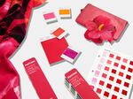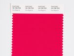
The Pantone Color Institute has been identifying colors of the year for the last two decades. Their pick for 2023 is a shade of magenta.
Pantone
It’s official: 2023 is the year of magenta. That’s according to the Pantone Color Institute, the authoritative consultancy that’s christened an “it color” every year for more than two decades.
Its latest pick is none other than Viva Magenta 18-750, which it describes as "a shade rooted in nature descending from the red family and expressive of a new signal of strength."
Other words the company uses to characterize the color — and, by extension, the current cultural moment — include powerful, empowering, electrifying, boundaryless, audacious and inclusive.
"Viva Magenta is brave and fearless, and a pulsating color whose exuberance promotes a joyous and optimistic celebration, writing a new narrative," it says.
An unconventional shade for an unconventional time:
— PANTONE (@pantone) December 2, 2022
a new vision. Color of the Year 2023: PANTONE 18-1750 Viva Magenta
Vibrating with vim and vigor, a shade rooted in nature descending from the red family demonstrating a new signal of strength.https://t.co/vxEQlBykRT#Pantone pic.twitter.com/pRIP6bI2NH
Some skeptics would point out that magenta doesn't technically exist, since there's no wavelength of light that corresponds to that color. But Pantone — which literally wrote the book on color-matching in the 1960s — defines it as a "nuanced crimson red tone that presents a balance between warm and cool."
Magenta is a hybrid in many senses, the color authority says, as it straddles the physical and the virtual, the organic and the innovative.
"It is assertive, but not aggressive, a carmine red that does not boldly dominate but instead takes a 'fist in a velvet glove' approach," it says. "Exuding dynamism, PANTONE 18-1750 Viva Magenta is a transformative red tone capable of driving design to create a more positive future."
"An unconventional shade for an unconventional time"
The Pantone Color Institute was founded two decades after the color company and has been championing colors of the year since cerulean blue in 2000 (cue the iconic Devil Wears Prada monologue).
The program aims to highlight the relationship between color and culture, and colors of the year are chosen because they reflect the global culture at a specific moment in time, according to Laurie Pressman, the institute's vice president.
Its selection process involves looking at everything from the entertainment and travel industries to technologies, cultural events and socioeconomic conditions, to analyze and forecast trends.
Pantone invented a completely new shade for 2022's color of the year: Very Peri, a light purple representing courage and creativity. In a first, it previously picked two colors — bright yellow and solid gray — to embody the dual moods of 2021.
This year, experts observed a "heightened appreciation and awareness of nature": People are bringing more plants and florals into their homes, finding newfound enjoyment in outdoor recreation and travel after the pandemic-induced pause and looking to nurturing, "life-giving ingredients" as a result of the public health crisis.

The magenta shade traces its organic origins to the cochineal beetle.
Huge
They say Magenta is fitting in part because of its organic origins, which it traces to the cochineal beetle, the source of red carmine dye.
There's also a psychological, emotional component. Pantone says magenta balances boldness and fun, confidence and humanity. It likens that to how digital spaces have accelerated globalization, allowing people to connect with others and deepen their empathy.
"The Color of the Year 2023 merges the richness, warmth, and strength of natural matters with the rich, open horizons of the digital world," Pantone says. "The result is a shade of red that expands our horizons of authenticity."
While last year's color also spoke to the balance between nature of technology, Pantone says what sets magenta apart is its "ability to answer our collective need for strength."
"Three years deep into a pandemic, facing a war, an unstable economy, social unrest, supply chain breakdowns, and mounting climate change, we need to heal," it adds. "And still, we need to find the motivation to continue. Here, Viva Magenta cloaks us in both power and grace, and sends us out into the world with the verve we've yearned for."
Why the color of the year matters
Pantone effectively makes a color into an industry celebrity, as University of Leeds business history professor Regina Blaszczyk told Planet Money's The Indicator in 2020.
Pantone's chosen colors of the year go on to influence product development and purchasing decisions in all sorts of industries, including fashion, industrial design and product packaging.
Viva Magenta is a "universally flattering shade," it says, offering tips for how to incorporate the color into your wardrobe, home and graphic design.

Pantone describes Viva Magenta as brave, optimistic and inclusive.
Pantone
It seems the "Magentaverse" is already upon us. Pantone has partnered with companies including Motorola, Spoonflower and Cariuma to release cellphones, wallpaper, skate shoes and more in the designated shade. And the art space ARTECHOUSE is offering an immersive magenta experience, starting during Miami's Art Basel and opening to the public on Saturday.
But Pressman says the program's goal isn't to promote a color, even though many colors of the year do become more popular as a result of their distinction. Instead, it aims to "help companies and consumers better understand the power color can have."
Color has power in consumer behavior — one 2015 study found that 85% of shoppers base their purchasing decisions on a product's color — as well as self-expression and communication.
Pantone has a lofty view of what color can do not only for people who are deciding what to wear or buy, but for society as a whole.
"It is a visual language we all understand, one whose message crosses genders, generations, and geographies," Pressman says. "Learning more about the unique meanings particular colors give voice to helps us to be a more expressive, closely connected society, one that provides people with a more holistic understanding of their peers and communities alike."
Copyright 2022 NPR. To see more, visit https://www.npr.org.